In a world of unfortunate circumstances, each generation runs into the same issue: how can I be sure my loved ones are okay while living my own life? Bay Alarm Medical offers a simple solution. BAM's wearable hardware and mobile app combination serve to provide users with immediate emergency alerts and a place to store vital health information.
However, their application is so much more bare than it could be. Essentially, it boils down to a glorified billing and account management application. With this project, my team and myself wanted to refresh the application and flesh it out. For such a useful, nearly essential tool, BAM is missing out on a huge opportunity for daily health maintenance and tracking. We can do more for our seniors than be there just for emergencies.
As a UX Researcher & Designer, I tackled this problem alongside three fellow UX professionals: Mounika Sammiti, Nikita Michayluk, and Kei Chan.
My primary responsibilities included User Research, Research Synthesis, Competitive & Comparative Analysis, Prototyping, Usability Testing, and Project Presentation.
Figma
Miro
Slack
Whimsical
February 2023
2-Week Design Sprint
So, where do we begin?
To start, we spent a good portion of time trying to wrap our heads around what Bay Alarm Medical does and why it does it. It currently exists as a series of wearable devices designed to empower senior citizens to reach out for help when they need it. Along with these devices, Bay Alarm Medical has two applications, a tracker application and an account manager application. While Kei was spearheading the research & discovery portion of the project, the rest of us collaborated to craft a set of questions that we would ask every interview participant (though we all ended up asking a few extra questions, too). Additionally, I spent time researching the iOS Human Interface Guidelines.
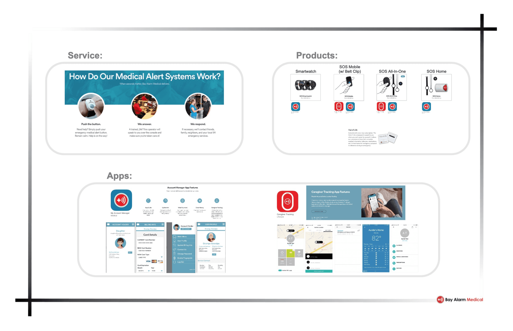
Preliminary Research.
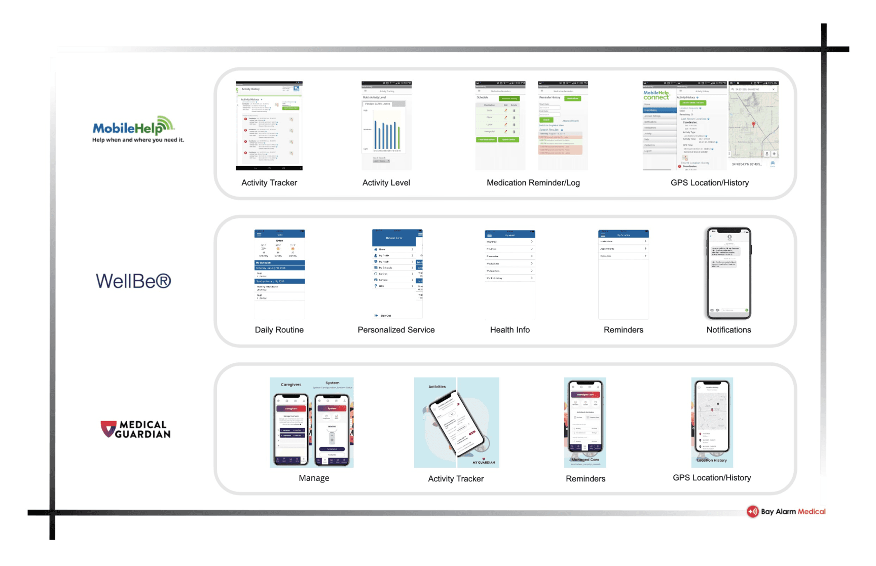
To begin preparation for interviewing, we wanted to have a better idea of how similar apps operated, the features they used, and how users feel about them. We looked into three alternative alert systems: MobileHelp, WellBe, and Medical Guardian. Below are some of their key advertised features, alongside some examples of their UI.
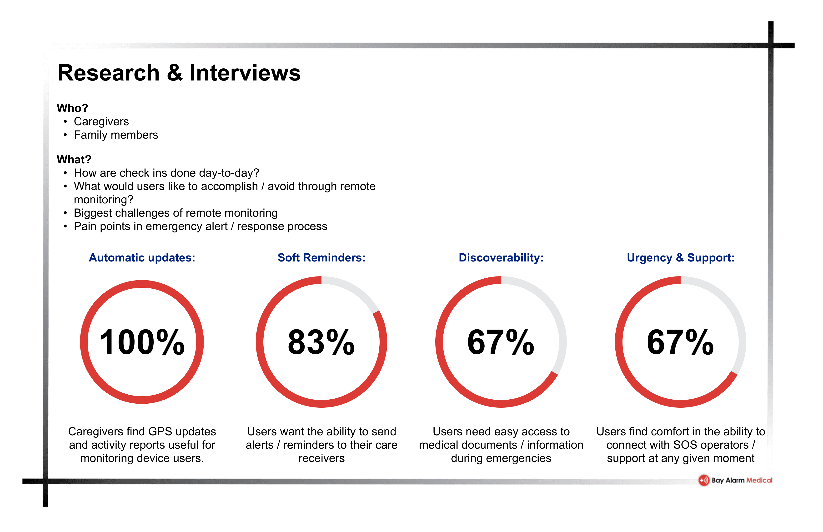
User Interviews.
It seems we lucked out this time. Nikita’s parents have built their career around providing care for the sick and elderly. So, we had access to participants who served as caregivers professionally, and could provide us insights into the needs of the elderly that the average person might not have. Additionally, we wanted to get some perspectives from what we expect a typical user might be. I interviewed my father, who acted as a caregiver for his parents alongside his two brothers. This was absolutely an uncomfortable and new experience for me, talking to my father about such personal topics that I knew so little of. While the interview experience was unpleasant, it pushed me to further lengths that I had gone before as an interviewer and I've grown as a result.
As part of our interviews, we also asked our interviewees to perform a MoSCoW sort with a list of potential features we had drafted together. This gave us a sense of what our audience’s priorities are and ended up playing a critical role in the overall design of our app.
Personas.
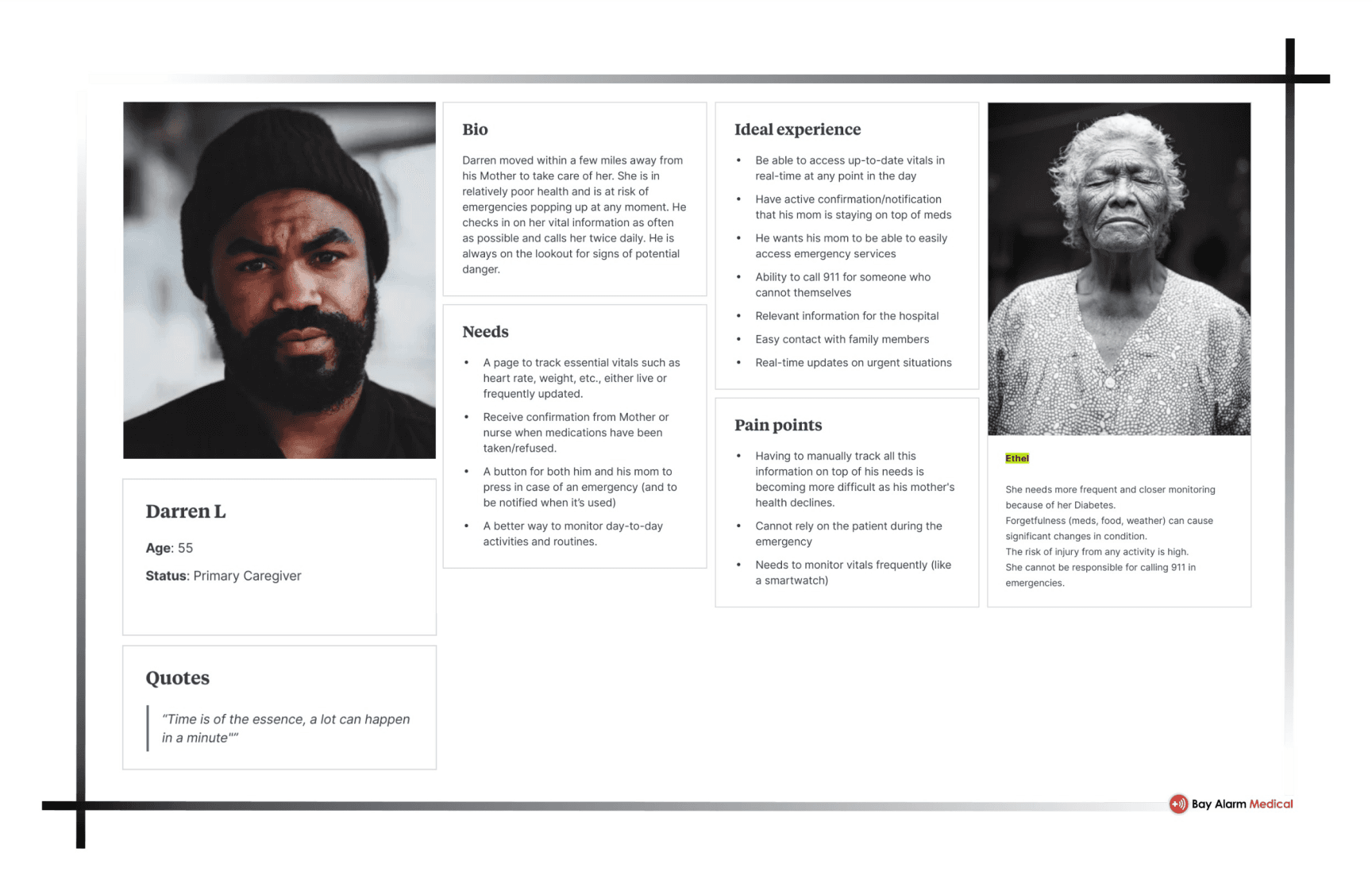
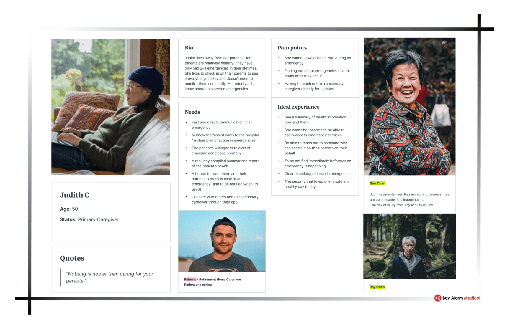
Through the synthesis of our research, we identified two personas that stood out.
The first persona, Darren L. is providing care to his mother, Ethel. She is at high risk of emergencies, and does not have a professional caregiver checking in on her. As such, it is incredibly important for him to be able to track her vitals, medication, and alert emergency services when anything seems awry.
The second persona, Judith C. is taking a more hands off approach. Her parents, Sun and Ray, are living in a retirement care facility and have a caregiver assigned to them to assist with daily needs. They are at low risk of emergency, so Judith does not feel the need to constantly monitor them. That being said, she needs to be aware of an emergency when/if it happens, and have features to monitor and track her parents during emergency service responses.
The second persona, Judith C. is taking a more hands off approach. Her parents, Sun and Ray, are living in a retirement care facility and have a caregiver assigned to them to assist with daily needs. They are at low risk of emergency, so Judith does not feel the need to constantly monitor them. That being said, she needs to be aware of an emergency when/if it happens, and have features to monitor and track her parents during emergency service responses.
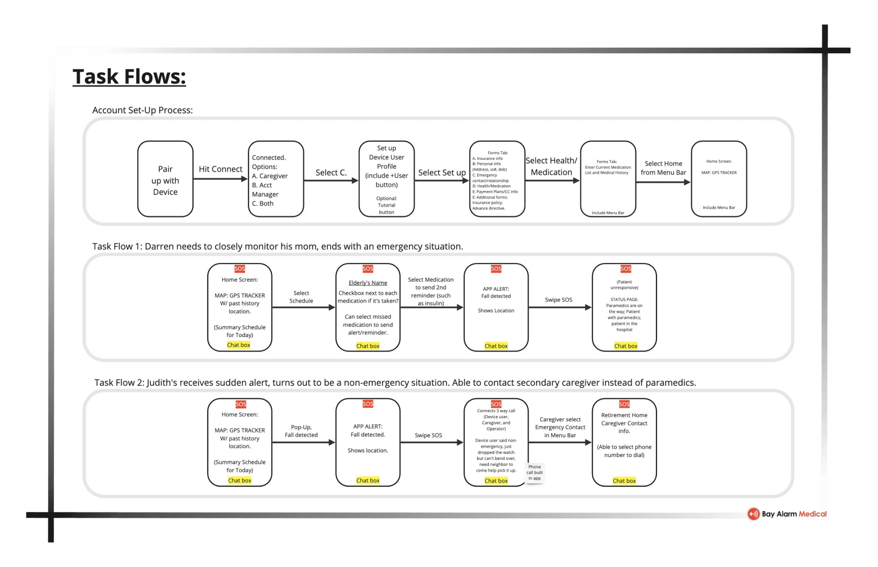
From here, we wanted to begin basic sketching and wireframing. To give us an idea of the screens we'd like to produce, we created a task flow for each persona.
Wireframing & Prototyping.
At this point our work became significantly more independent. Mounika’s primary focus was the Journey Map, Kei’s primary focus was the App Map, and Nikita and myself focused on wireframing. Wireframing was a blast, as always. It’s absolutely the part of our work that excites me the most, and my rudimentary wireframes were completed within a day. At the end of each day, we would all come together and provide feedback on the wireframes, and spitball additional ideas. In that way, our wireframes were constantly changing. Looking back, I wish I had saved each day’s version of the wireframes, however we had adjusted the one file of our wireframes directly with each proposed change.
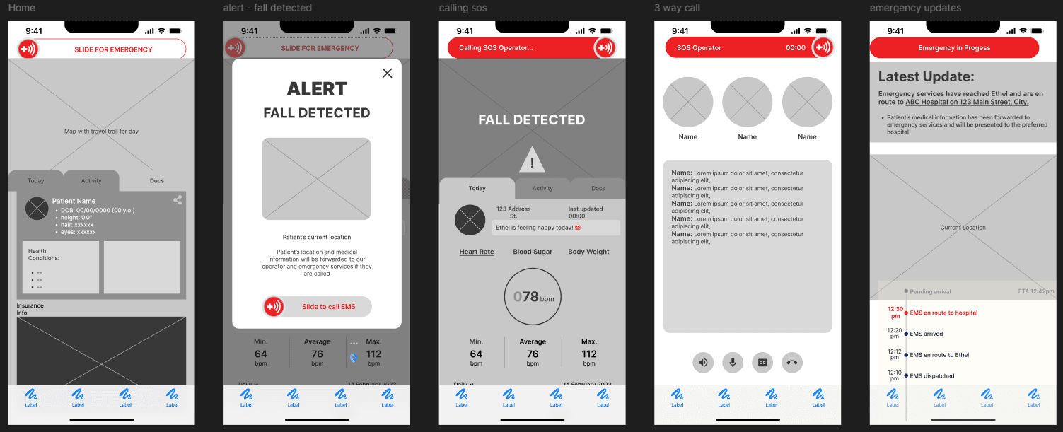
Once we were nearly completely satisfied with the wireframes, we launched our high fidelity conversions. While this was still one of my primary tasks, I did take a little more of a backseat here in the choices of colors. I did however, urge the team to exclusively reserve the color red for emergency functionality.
Something which I wish could have gone differently here was our use of drop shadows. The iOS Human Interface Guidelines typically avoids the use of depth indicators, opting to work in a 2D space. While it was initially my intention to follow this closely, we were not able to do this without convoluting our wireframes. Additionally, we wanted to keep in mind our audience - a generally older population that the other groups were working with. We finally decided to go against the iOS HIG in order to give our designs a more tactile feel that our audience would be familiar with. Once we were happy with our designs, we created our prototype interactions. I have very little to say about this as it was quite straightforward, with our only issue was creating an interaction between frames, when one frame included a slider component that had an interaction within it. This was easily solved by turning our frame-to-frame action interaction into a delay interaction.
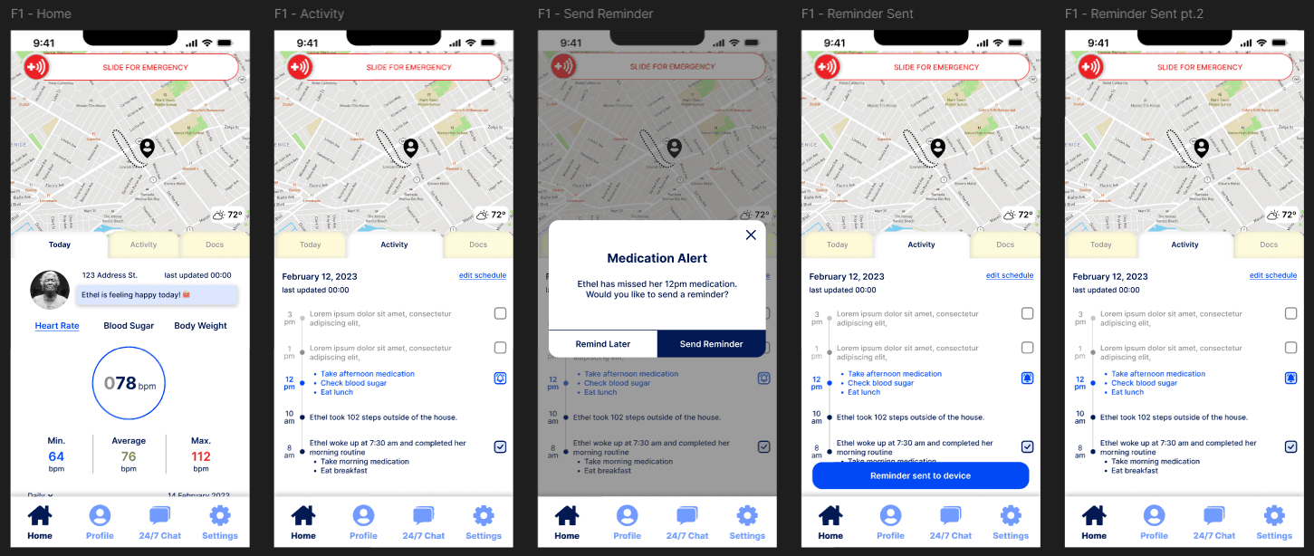
I've also included a mostly functional prototype that follows Darren L.'s task flow. Please feel free to peruse.
Usability Testing.
Now, we must conduct usability testing of our high-fidelity wireframes. We wanted to identify any pain points that users experience when interacting with our screens. With the subject at hand we must ensure that users have a seamless experience - any delay caused by poor UI choices would directly translate in time lost during an emergency.
We selected 4 participants between the ages of 30 and 50 to complete several tasks.
Task Sheet:
Check vitals
Send a medication reminder
Contact an emergency operator
Connect to a secondary caregiver
"It was very confusing"
"Where is the medication reminder?"
"What does it want me to do?"
"Where do I go to call another caregiver?"
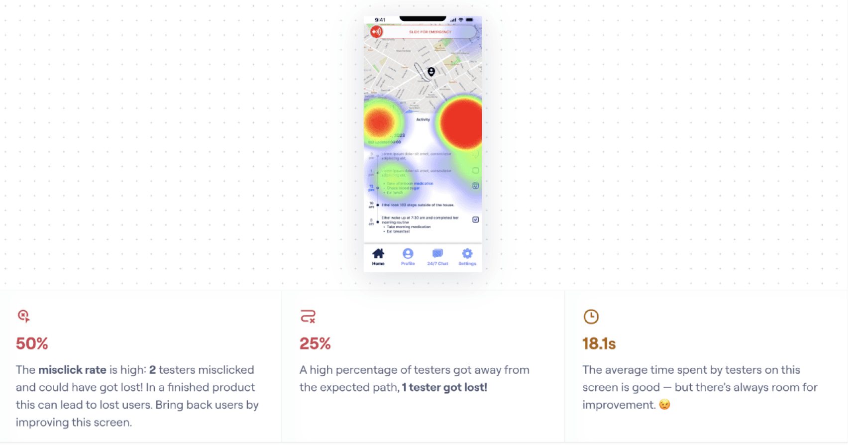
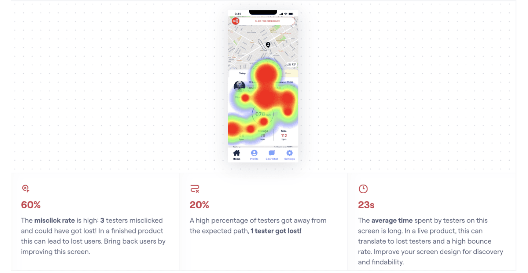
It was clear that the design choices we had initially made were far from intuitive to the majority of our users - a disappointing failure. But, that's the way it goes. It meant that we had to get back to the drawing board. We iterated, now we must review and reiterate.
The primary issue was that our users noted difficulty navigating the screens. We decided to completely overhaul the labelling to make it much clearer where things were.
Conclusion.
It took a lot of effort for us to find our rhythm as a team, and there were many opportunities for me to facilitate this, but with my unfamiliarity with the team I found myself falling into a more passive role to avoid causing any disruption. I do regret this. I've actively pushed myself to ensure my input is heard and taken seriously in more recent projects. That being said, I am still proud of the work I completed, and of the summation of our efforts as a team.
Going forward, I would love the opportunity to conduct further rounds of usability testing, as we never got the chance to see how our changes were perceived by users. I imagine in this world of incremental progress we live in, we would be met with further revision and reiteration, but I believe this work can be taken much further to create as delightful of a product as possible.
My sincere thanks to Kei Chan, Mounika Sammiti, and Nikita Michayluk for their contributions to this collaboration.
Back To Top
