One of the reasons I love UX design is that it doesn't feel like work. So, outside of my assignments I offer my assistance to friends with a smile on my face. Here is the start of a collection of little side projects I've done, with very brief summaries of my experience.
Realists - Gear Requirements
Overview
Runescape - a world of wonder, beautiful scenery, daunting monsters, sublime quests, and hundreds of thousands of players. I first played Runescape, an MMORPG born in 2001, as a little boy. I couldn't have been older than 4 years old when I first set my eyes on the beautiful world of Gielinor. With the release of "Old School" Runescape, a time capsule of the game's state in 2007, I revisited the world and have created bonds with fantastic people all around the world.
My friend, M A T E O, leader of a clan called "Realists", decided to create a set of equipment requirements for incoming members to meet. As a close friend of his, and a lover of design, I offered to create this graphic for Realists.
My Role
As a UX Researcher & Designer, I undertook this project independently.
Methods & Approach
My primary responsibilities included User Research, Research Synthesis, Competitive & Comparative Analysis, Prototyping, and revision with client feedback.
Tools
Figma
Discord
Old School Runescape Wiki
imgur
Timeline
May 2024
3-Day Sprint
Where we began.
M A T E O, the leader of the clan, Realists, needs help. Of course, I answered the call to action. YlKEZ, a moderator for the clan provided me with a list of gear and account levels that would be required going forward.
Through the first week of this project, my team and I dove into the depths of discovery - and boy was there a lot to discover. Right off the bat with HIERR's project brief, the more we read the more questions we had.
What did our client want?
A single piece graphic with all requirements for application consideration
Images and labels for each piece of gear and account levels required
The clan logo must be present in the graphic
A link to the discord server for the clan must be present in the graphic
Prior to this, my design experience revolved around designing commercial websites and apps, but with free reign of creative liberty, I was deeply excited to explore this project further. Better yet, I have years of experience being a part of the community and users that the product is intended for. And so, we begin.
Comparative Analysis.
Clan requirements are commonplace within the world of Runescape clans. I was no stranger to the topic, and had seen plenty myself. The clear starting point for me was to identify examples that I found suitable, present them to M A T E O and YlKEZ, and Realists staff for approval.
I came across a gear requirements graphic from "Renatus", another Runescape clan. This example excited M A T E O the most, and so I drew inspiration from it as a starting point for the project.
Wireframing & Iterating.
I started with the very basics. A rudimentary layout of the equipment cells, a test for color, and some equipment icons for size reference (especially relevant for the few cells that would contain multiple icons as per M A T E O's request).
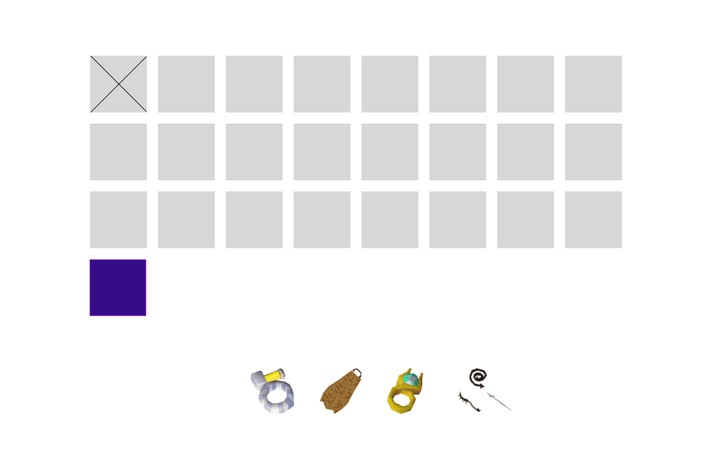
With the basics down, it was much easier to flesh out the entirety of the graphic. I captured colors from the Realists logo and applied them to the different components of the screen to establish a color theme - and to make it pretty of course.
The equipment icons were acquired through the Old School Runescape Wiki, a massive non-profit community effort to catalogue the entirety of the world of Runescape. Hats off to the contributors over at the Wiki - you're doing God's work.
I wanted to test the waters with a color key that is commonly seen throughout Runescape: red for melee gear, green for ranged gear, and blue for magic gear.
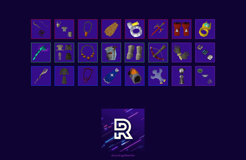
I brought this first draft to M A T E O and his staff team to review before getting any deeper into the designs. My idea to theme gear based on style colors (red, green, blue) wasn't received as positively. I wasn't married to the idea anyway, so I defaulted to bordering each cell with a pink pulled from the Realists logo.
Beyond that, the Realists staff team had a positive reception of the first mockup and I received the go-ahead for further drafting.
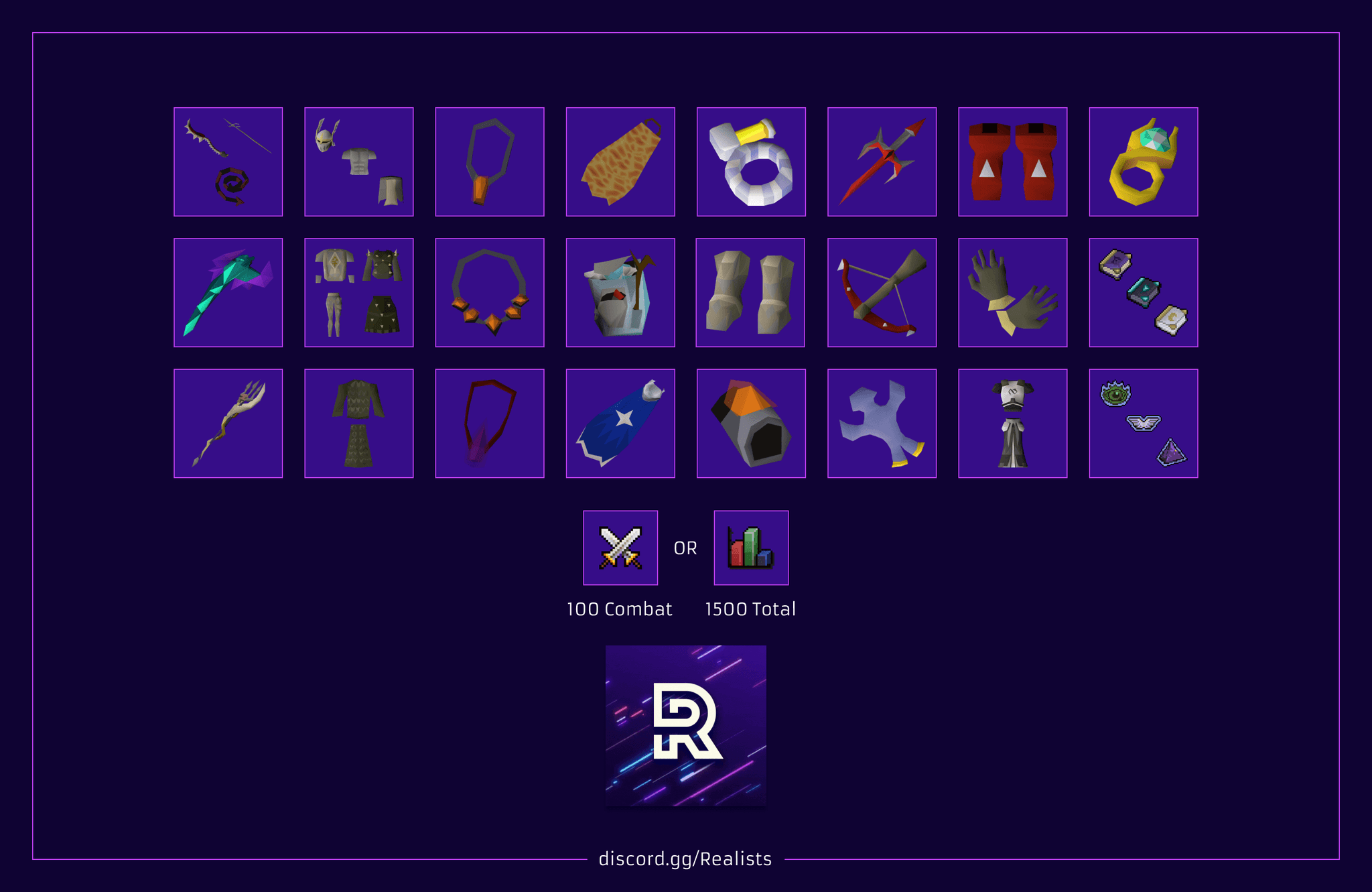
The Realists staff were very happy with this draft, and so was I.
But, lo and behold, the Realists staff had decided to make changes to the requirements halfway through the design process. Such is the life of a designer.
With additional gear added to the list, and a request for the graphic to be presented in portrait, I jumped back into Figma.
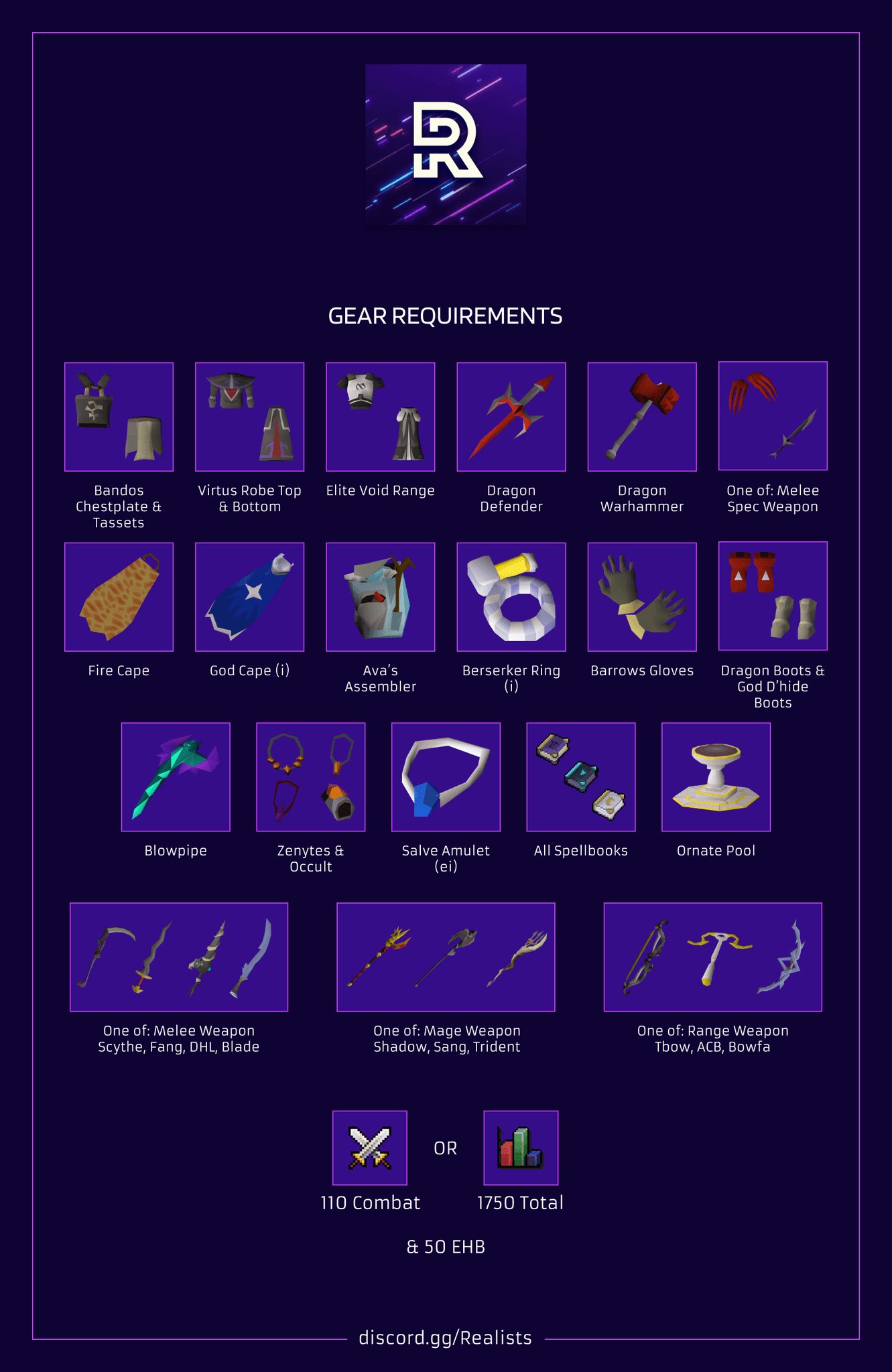
Hideous. The portrait layout made cell organization awkward, sections were bigger than I would have liked, and it posed a functional problem as well. With the graphic opened in its full-sized glory, users were forced to scroll through the graphic for it to be large enough for the text to be legible.
I insisted that this wasn't the best version of itself that it could be, and told the Realists team to give me a moment to exercise some creative freedoms and return with another version for them to compare to. They agreed.
I also figured that a graphic for the wondrous fantasy world of Runescape should include a little more pizzazz.
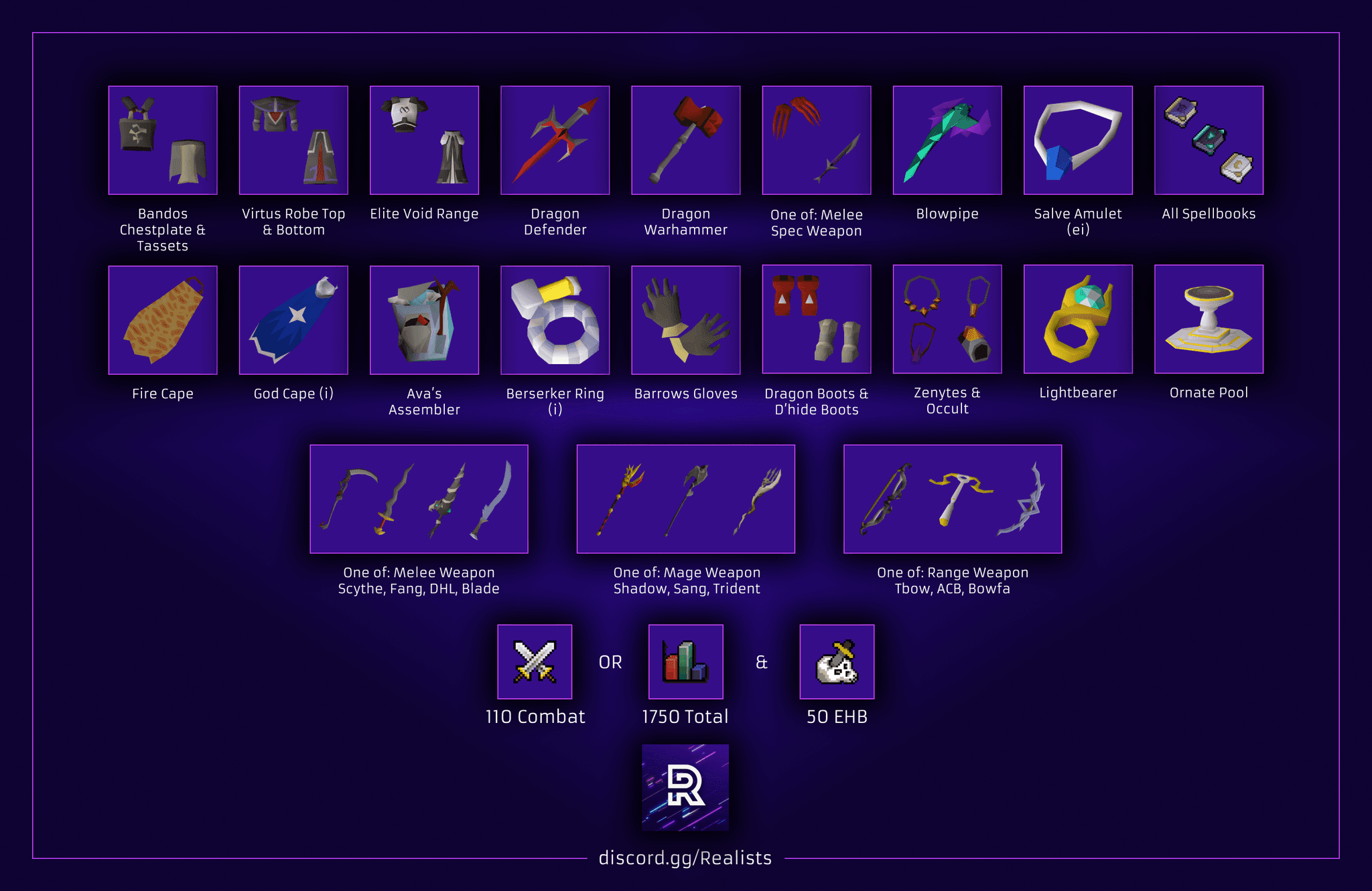
With extreme drop shadows, and an excessive diamond gradient, the final version was born. While these features may seem ridiculous in a more professional setting, I found they fit perfectly for the environment of this project, and the staff team at Realists agreed.
Conclusion.
What a pleasure it was to work on this project. To give back to the community that has given me so much joy is a true honor. While this project was light on research, the wireframing and prototyping required several rounds of iteration to meet the client's standard. From following specifications to exercising my own design freedoms, I am delighted by the final product.
Shoutout to Realists - you have all been a joy to know.
Back To Top
