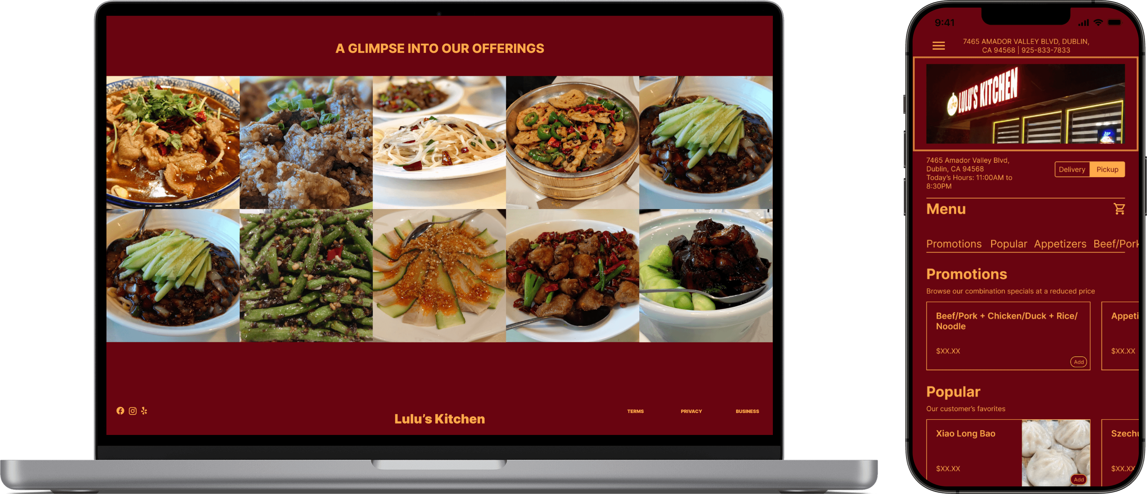
A local hidden gem, Lulu's kitchen offers a divine and authentic selection of Shanghai and Sichuan dishes. Lulu's Kitchen is the real deal, and my family has spent countless evenings here enjoying our time together among fantastic food.
However, when leaving a review for their restaurant I discovered that their ratings were far lower than their food would suggest. With some investigation, it appeared that the majority of the negative reviews for Lulu's Kitchen directly commented on the frustrating, or at times completely broken, online ordering system. Upon visiting their website, I couldn't help but agree. So, I took it upon myself to give Lulu's Kitchen a complete overhaul.
As a UX Researcher & Designer, I undertook this project independently.
My primary responsibilities included User Research, Research Synthesis, Competitive & Comparative Analysis, Prototyping, Usability Testing, and Project Presentation.
Figma
Whimsical
January-February 2023
3-Week Design Sprint
The Beginning.
Goals
Discover the pain points of the current online order portal for Lulu's Kitchen
Gain information on why a user may prefer ordering online versus calling in
Learn more about the information a user needs to make their online ordering experience optimal
Lulu's Kitchen holds a special place in my heart. As the son of a Chinese woman with unattainable expectations, and a staggeringly high floor for what is palatable, Lulu's Kitchen is one of the few Chinese eateries near my home that my mother is willing to visit.
So if the food is authentic, delicious, and affordable, why is Lulu's Kitchen plagued with negative online reviews?
Local guides "Mahal" and "SC" with 228 and 64 reviews (respectively) may have a starting point for us.
"This is the only Chinese Restaurant that i waited so long for online order"
"Ordered food online and it took me 30-40 minutes to figure out how to order. Will never ever order from this restaurant"
When sorting through the Google Reviews for Lulu's Kitchen, customers had remarkable things to say about the restaurant when they sat down, ordered, and ate at there. But, the negative reviews all mentioned one thing: online ordering.
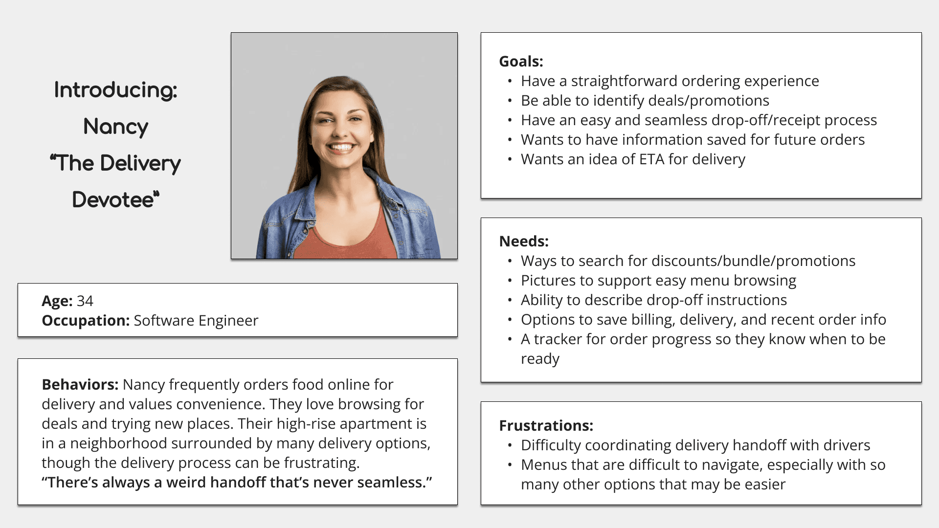
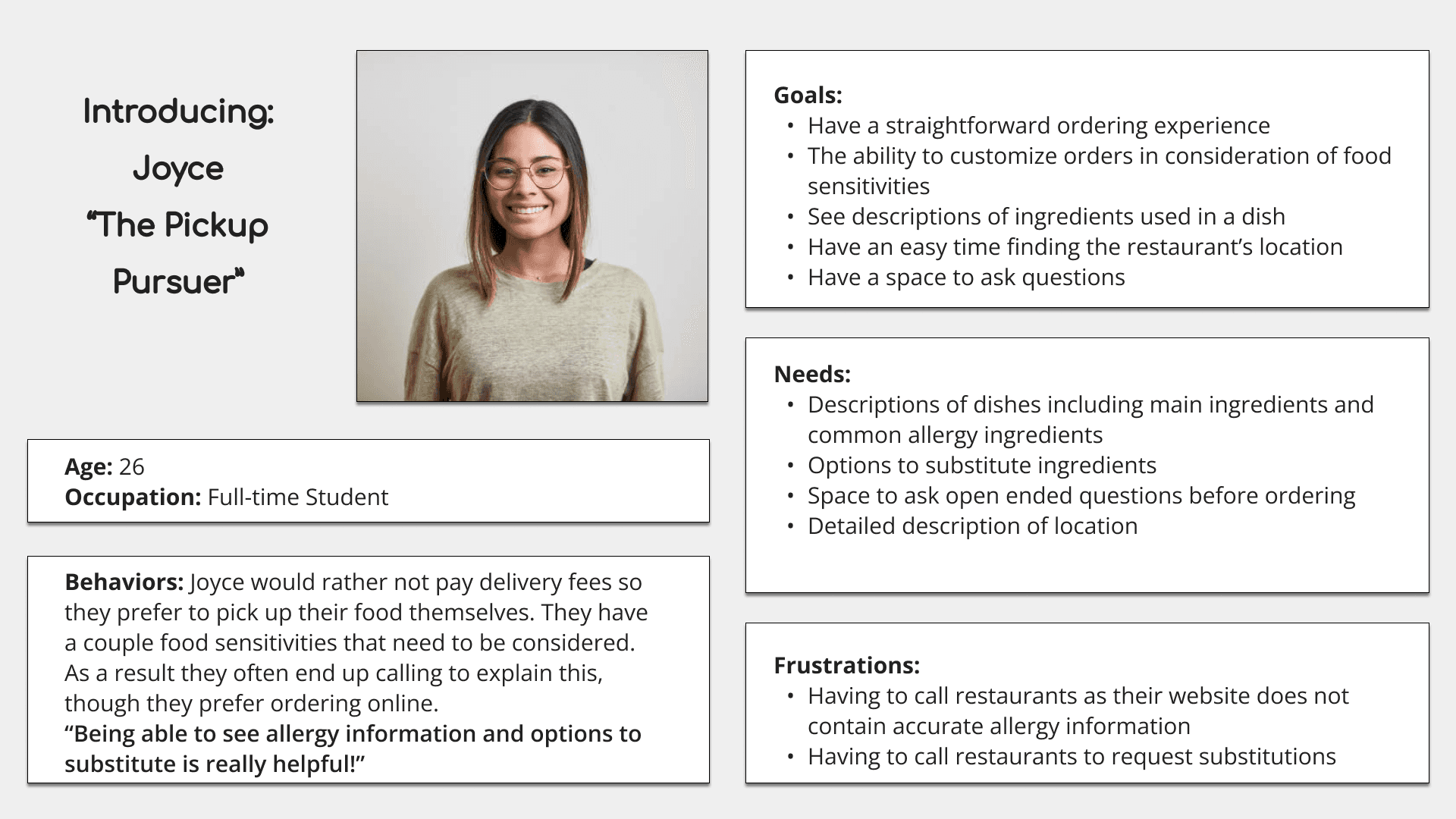
User Interviews.
Comparative Analysis.
From the user interviews I performed, I received two examples of online order portals with glowing reviews. I opted not to dissect the portals of more mainstream delivery services as I wanted a portal that would better service smaller businesses, in the way that the examples provided did.
The first website I used was the online order portal for Pia's Kitchen, a small restaurant local to one of my interviewees that they found pleasant to use. Performing a task analysis I found that the complete ordering process took at minimum 13 steps to place an order.
The second second website I used was the online order portal for California Chicken Café. Albeit not a small business, it is definitely a smaller chain when compared to others. Performing a task analysis I found that the complete ordering process took at minimum 17 steps to place an order.
Primary/essential ordering features:
Navigate to the menu
Select an option for receipt of order
Select menu items
Options for customization and allergy information
Input payment information
Both websites included the basics, but why is it that California Chicken Café included additional steps?
"One thing I love about the Café's website is that there's a bunch of places to put in your information and preference for next time. While it hurts my bank account, it makes it so easy for me to get what I want when I want it"
Aha! Information like this is what makes this comparative analysis and interviewing process so valuable. It sets us up for success!
Card Sorting.
According to the user interviews, one of the major pain points of the Lulu's Kitchen website is the excessive number of food categories listed. Many items were even found in multiple categories. It made it nearly impossible to find what you want to eat beyond looking at the "popular items" section. So, I conducted a card sort. By listing every dish and asking interviewees to create categories and match each dish to them, I was able to identify trends in users' perception of what belongs where.
This card sort involved 45 cards and 6 participants. 9 categories emerged, and 2 were added later based on follow-up interviews.
Promotions
Popular
Appetizers
Beef/Pork
Chicken/Duck
Seafood
Tofu
Rice/Noodles
Soup
Specialty
Vegetables
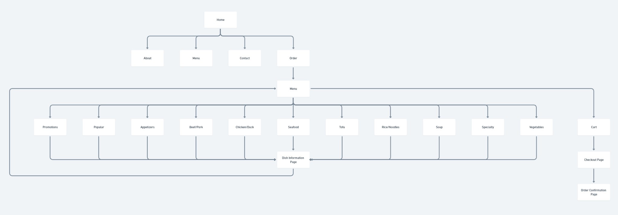
Site Mapping.
Using the above categories, we were able to being site mapping for the proposed website.
Sketching, Wireframing, & Prototyping.
And now, to the drawing board. Pulling inspiration from Pia's Kitchen, California Chicken Café, and more, I constructed a few rudimentary sketches to provide a starting point for the oncoming wireframing.

With a vague idea of what the users wanted in an online order portal, and sketches to reference, I created low-fidelity wireframes.
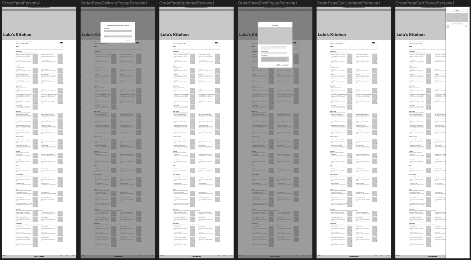
Feel free to view the Figma files above if you're interested in getting a better look.
I particularly enjoyed this step of the project. For the topic at hand, it was imperative to utilize functional and clean components that can be assembled en masse without creating clutter. I took advantage of this opportunity to create a myriad components, all equipped with multiple variants. This proved to be worth the effort as you can see how simple it is to create new pages when browsing the Figma files. With the sheer number of components used, a copy + pasted image does not do the work justice. I highly suggest viewing them on the first page of the Figma file below.
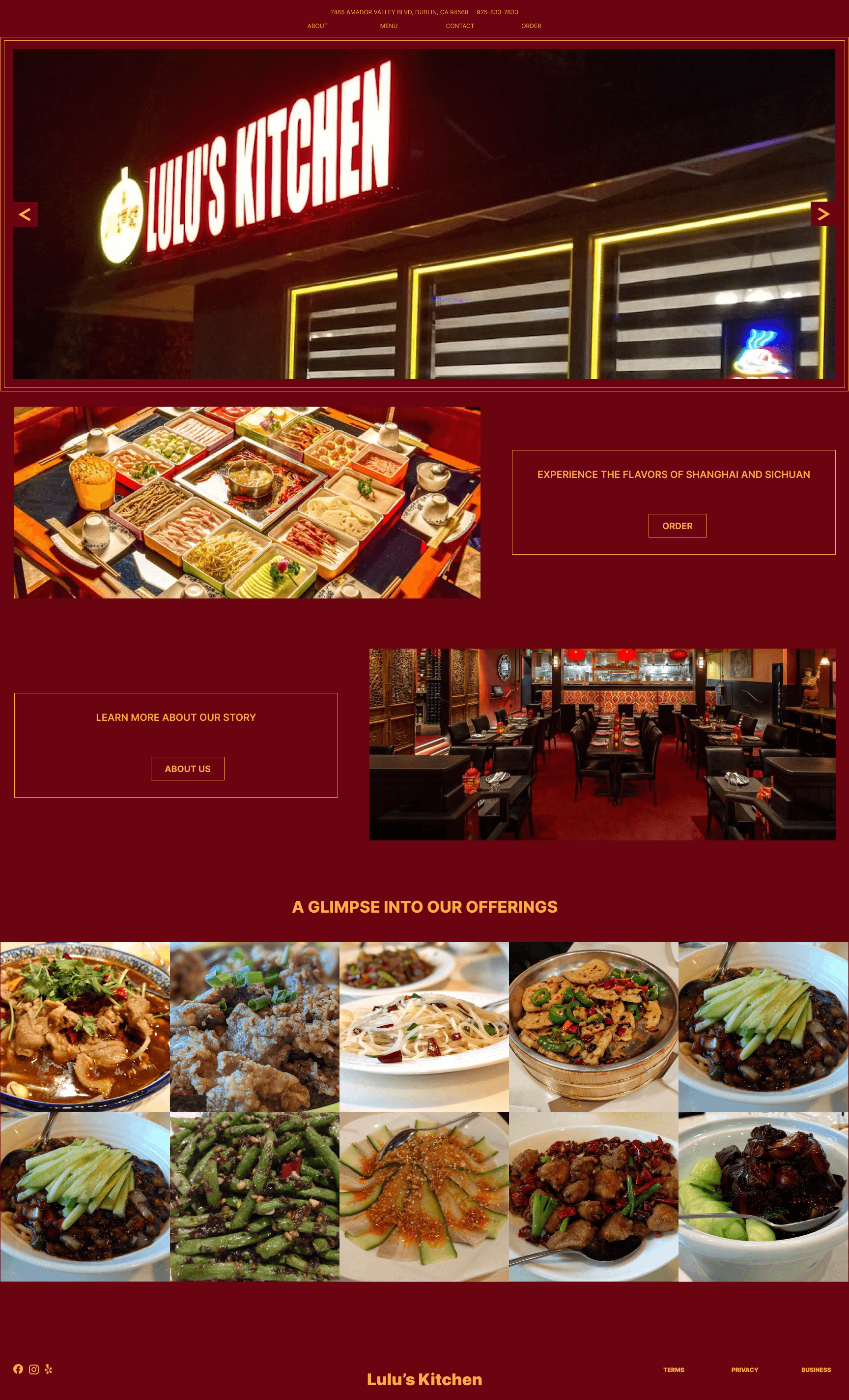
From here, I began my first venture into full color experimentation. A daunting task to someone like myself - a lover of black, white, and grey. While I'm not entirely satisfied with the result, I am proud of myself for going bold with the design. I intended for the online menu to resemble a physical one you'd hold in your hands at a restaurant. I wanted the colors to pop, and to match the red and gold branding of Lulu's Kitchen - two colors quintessential in Chinese culture.
I also made sure the produce a mobile version of the website, which can be viewed alongside the desktop version.
Conclusion.
I started this project out of the love for food that I share with my family. Food touches the soul in a way that very little else can imitate. For one of my favorite restaurants, this project is a small thank you for the experiences that Lulu's Kitchen has provided me with. I wanted to identify the pain points that lead to negative reviews that may dissuade users from giving this hometown spot a chance. As the research shows, there is a host of fantastic techniques and best practices that the restaurant industry utilizes to ensure their users have a simple and delightful experience with online platforms. If time permitted, it would be a pleasure to continue working on this project and playing with colors in new ways, and make these hues a little easier on the eyes, so to speak.
Back To Top
